New look, same commitment
- MSPC Newsroom
- Jul 6, 2023
- 1 min read

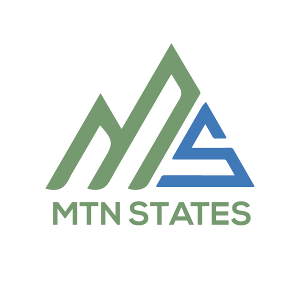
It is an exciting day for Mountain States Policy Center. As we prepare to celebrate our one-year anniversary, we're updating the organization with a new, more modern look. Successful organizations have a memorable logo that makes a strong first impression. Our new logo sets the foundation for what we do, and it separates us from other organizations. The new look features the same colors as before - those familiar in the Mountain States. But it also includes an "M" and "S" built into a mountain scape.
MSPC board member Bonnie Quinn Clausen and our communications and marketing team took the lead in designing this updated look, and we are delighted with the final product. What do you think?

Nothing changes regarding our work and our commitment to factual research based on free markets. Our slogan remains "Free Markets First."
But we believe this updated logo helps set the stage for our future - which begins now. And you're invited to be a part of it. Anyone who starts a monthly, recurring contribution today will receive a gift featuring our new logo. Your support makes this work possible, and we're thrilled to be able to share this moment in our history with you. Thank you!


I like how this update keeps the rebrand grounded instead of overexplaining it. The new logo, mountain imagery, familiar colors, and the “Free Markets First” message all work because they show continuity without feeling stale. For me, that balance is exactly what is tone in practice: the design says modern and confident, while the words reassure readers that the mission, factual research, and commitment to free markets have not changed. I also appreciate that you credited the communications and marketing team, because that human detail makes the announcement feel more sincere. A fresh look lands better when the voice behind it still feels trustworthy.